H5 平台几种方案
1. 使用百度H5
买一台主机配置一下,使用起来比较方便
2. 鲁班H5平台
有源码,但不适用于商用
3. swiper
swiper是一个基础框架库,可以用这个来自己手写
4. taro
https://taro.aotu.io/
框架是京东下面的一个很有意思的框架,可以同时做app、小程序、H5多端,同时提供了比较好的案例可以直接下载使用
使用react+redux实现,比较有意思,可以研究一下。
5. wechat-h5-boilerplate
https://github.com/panteng/wechat-h5-boilerplate
可以用这个手写,体验效果还是比较好的
可以考虑使用
6. iSlider
也是一个可以自己实现的插件工具
一篇博客介绍相关H5运营内容
http://www.ptbird.cn/h5-tool.html
多端开发框架汇总
https://blog.fundebug.com/2019/03/28/compare-wechat-app-frameworks/
腾讯开源
图片颜色画板抓取
color-thief-py
分装的很好,可以直接安装使用,提供api非常方便
colorfic
这个也不错啊
Text2Colors
这个非常有意思,一定要研究一下
后面可以多研究一点这种类型的应用。集成到平台中去
rayleigh
使用颜色搜图
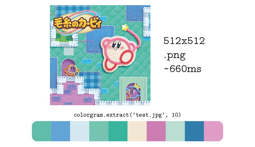
colorgram.py
可以取色
paintingReorganize
Use PCA analysis to reorganize the pixels of a painting into a smooth color palette.
颜色的分析
https://github.com/athoune/Palette
https://github.com/fundevogel/we-love-colors
https://github.com/tody411/PaletteSelection
瀑布流
Waterfall
宽度自适应瀑布流
https://myst729.github.io/Waterfall/
还可以,做成了异步加载
waterfall
原生 JavaScript 实现的瀑布流效果,兼容到 IE8。
Stick
stick是什么 stick是一个响应式的瀑布流组件。
weibocard
Columnizer-jQuery-Plugin
column layout
列式布局
ftcolumnflow
文字的流
查询关键字 column grid
一种比较神奇的排序算法
可以研究研究的神奇的排序算法
这个一定要研究一下
elastic-columns
效果看上去不错,但是感觉实现比较复杂
columns.js
这个包需要好好研究一下
masonry
比较好用的包,代码也比较简单
比较推荐
bootstrap-waterfall
Bootstrap的
比较推荐
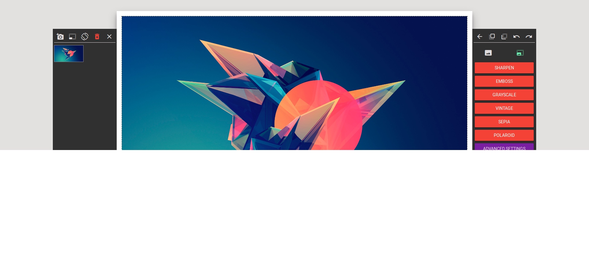
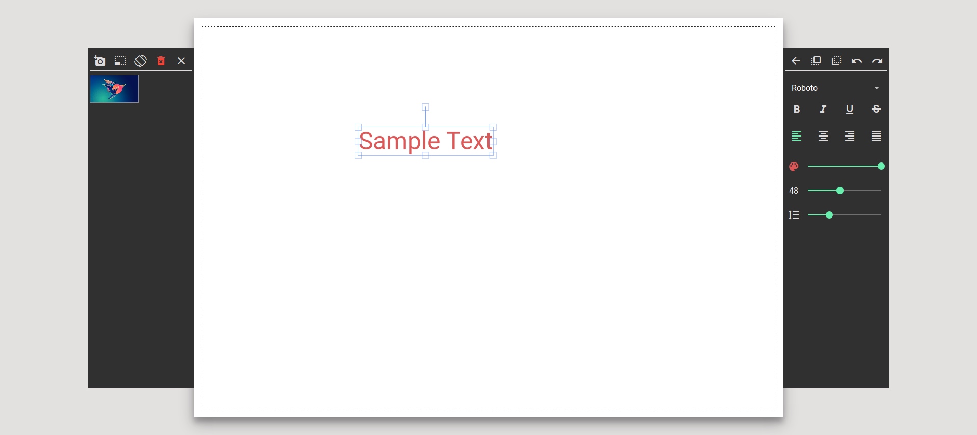
图片Editor分析 fabircjs 扩展包
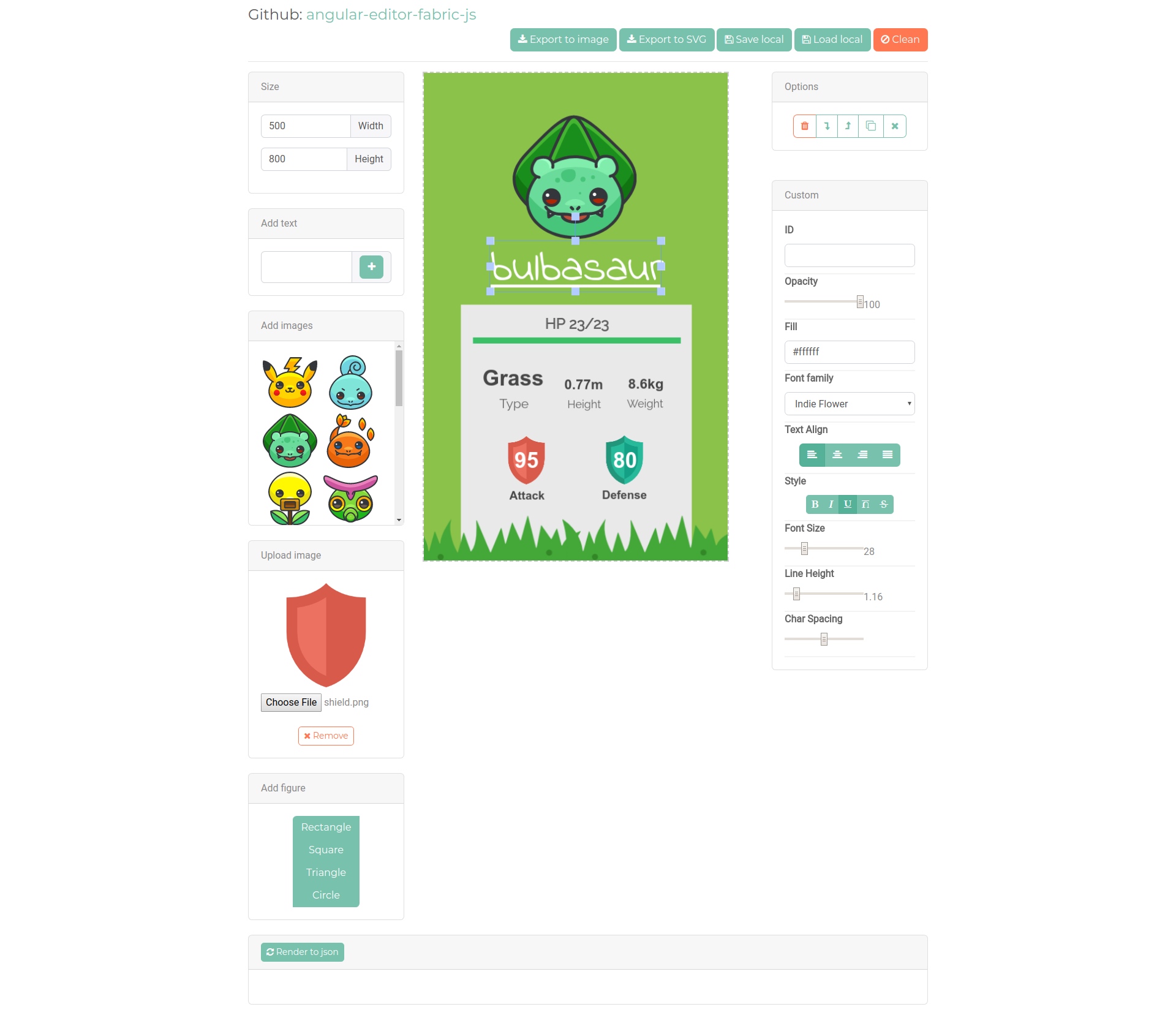
angular-editor-fabric-js
非常好的使用fabric实现的angular带工具栏的内容
angular-fabric
这个也做的比较好,但是前段页面总是卡卡的,不知道是什么原因
react-fabricjs
react版本,但是没有看到demo
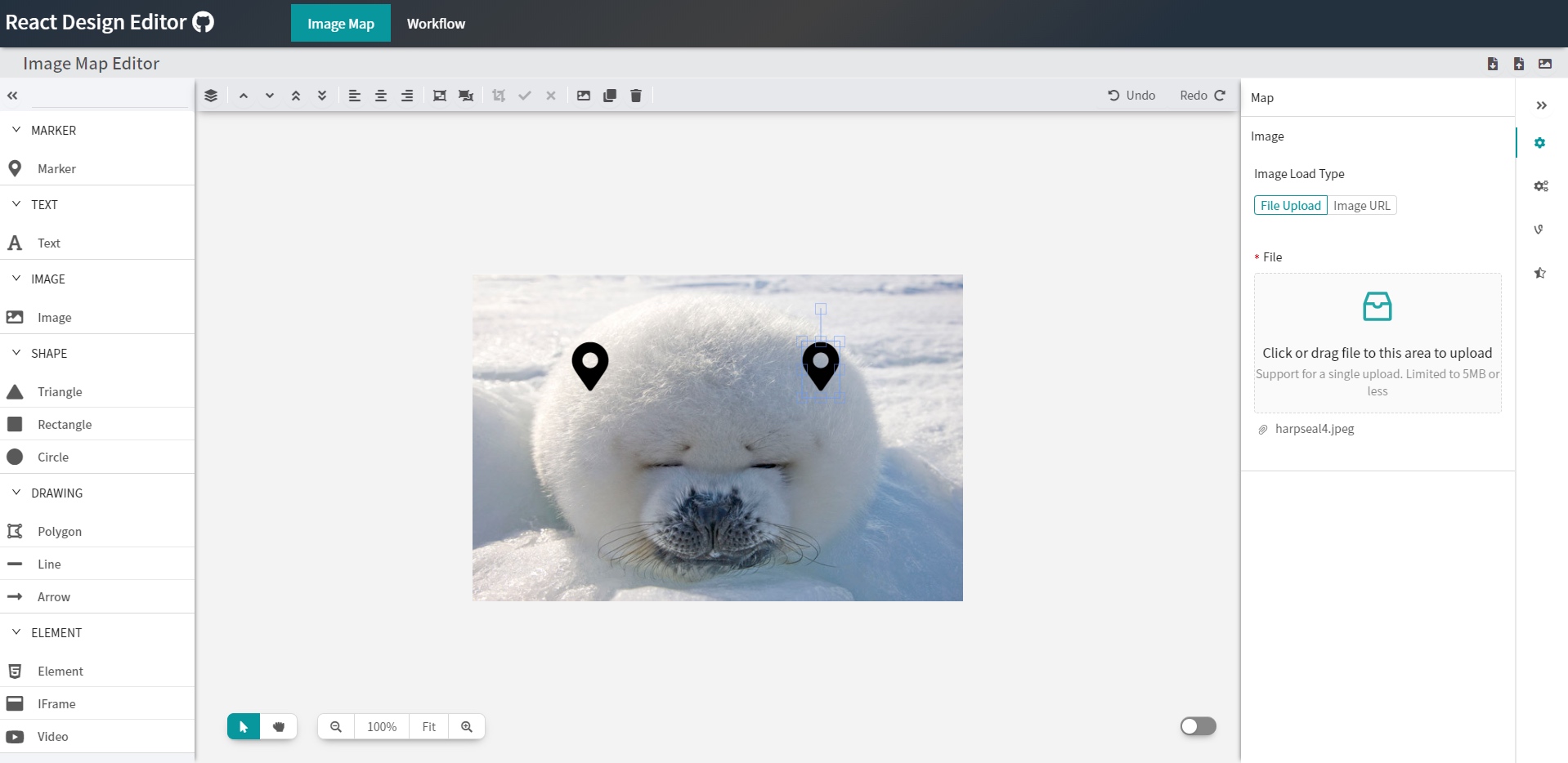
React Design Editor
非常好的基于react的可拖拽花瓣框架
vue-fabri
vue版本的fabric,没有截图
multi-draw
☁️ 基于Fabric.js+Socket.io的多人在线实时同步画板
demo挂了,看不到,可以跑起来看看
floido-designer
这个感觉非常靠谱。
还是用了electron,这样的好处是可以做成客户端了。体验会更好
vue-card-diy
手机版的自定义画板
react-sketch
样子做得一般般,但是可以使用了,用来学习是不错的选择
pie-js
还比较不错
geckos
An online Card Editor with Templates http://gulix.github.io/geckos/
没运行起来,后面可以试试
基于canvas的高级画板程序.
全局绘制颜色选择
护眼模式、网格模式切换
自由绘制
画箭头
画直线
画虚线
画圆/椭圆/矩形/直角三角形/普通三角形/等边三角形
文字输入
图片展示及相关移动、缩放等操作
删除功能
支持画板同比缩放
支持图形即时显示
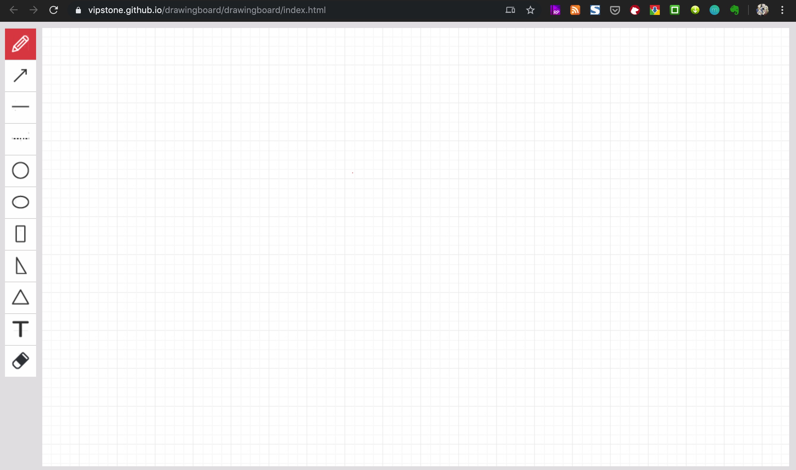
lukis
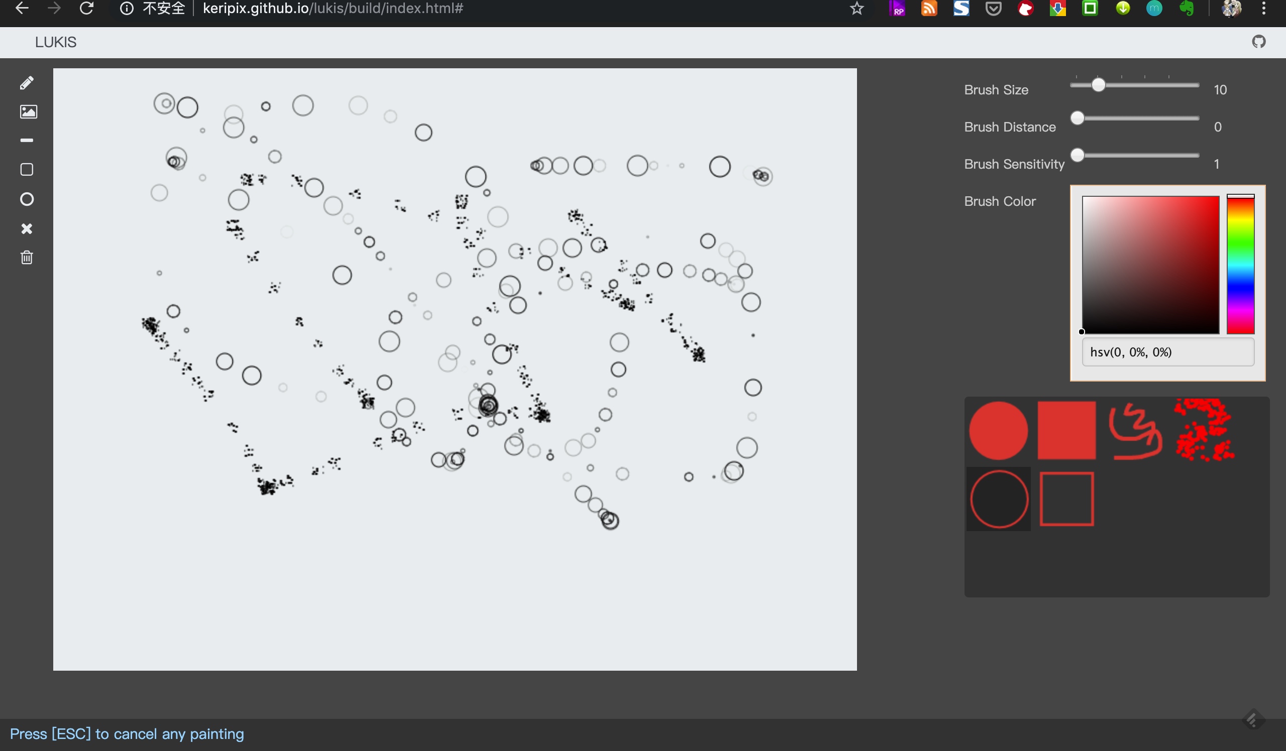
photo-chrome
A state of the art web based photo editor module made using angular v4
值得好好研究研究的项目
[fabricjs-pathfinding](https://github.com/kevoj/fabricjs-pathfinding)
可视化的走迷宫,非常好的demo例子
AngularJS & FabricJS - 2D - Diagram
A browser-based 2D diagram editor, built using AngularJS, AngularUI and Fabric.js. This project is built by [Big-Silver].
react-redux-fabricjs
Fabric.js with React/Redux
图片Editor 分析
tui.image-editor
Full-featured photo image editor using canvas
mini画板
这个一直在更新,是可以使用的工具。使用npm和js进行管理
WebGL Filter

python 和js写的
fabric-js-editor
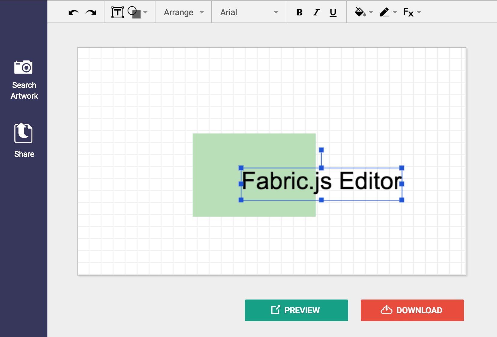
这个就是现在需要的针对图片和文字编辑的开源组件。他使用的是Fabric.js
Fabric.js
在这个网站上有很多针对网站的实现的内容,研究清楚这个可以直接进行编辑。
https://github.com/aurbano/nuophoto
这个实现的一般般
PlantUML Editor
https://github.com/kkeisuke/plantuml-editor
基于vue的 online UML编辑器
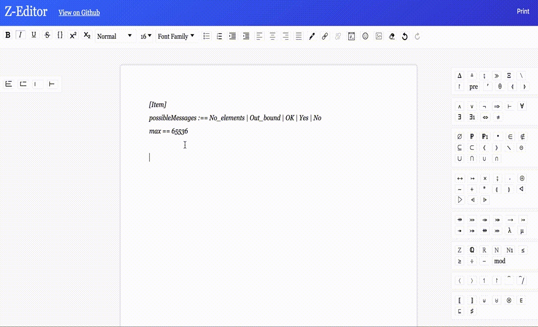
文档editor
https://github.com/Z-Editor/Z-Editor
https://z-editor.github.io/
A tool to create, edit and print formal Z-notation documents.
Method-Draw
非常非常好的图片Editor
yanshuo.io
用CKeditor来做的??
Markdown PPT 工具 分析
平时的文档基本上都以markdown形式进行输出,markdown可以导出到blog, gitbook, jekyll等等模型中。那么同时markdown也可以直接生成为对应的PPT,在平时讲解的时候方便直接进行投屏讲解。减少很多的制作PPT需要花费的时间。这里主要整理当下比较流行的markdown模式的ppt工具
nodeppt
nodeppt 2.0 基于webslides、webpack、markdown-it、posthtml 重构,新效果。
其中webslides使用
使用npm进行部署,所以安装和使用非常简单,只有2条命令就可以发布markdown到PPT模式。
支持的翻页效果较多,行列式也较多,整体的PPT样式看上去是很不错的。
同时支持echarts、流程图 mermaid,数学符号 KaTeX 三个插件
相关文档支持也比较好
webslider
webslider
是刚才nodeppt的基础包。这个做出来的东西设计感很强,可以点击这里看一下他的demo
但是使用起来是使用XML的模式进行写作,从markdown调整过来会比较复杂。
Marp
marp
是一个基于electron框架开发的PPT工具,所以支持多个端。最终还是到网页上进行显示
他是直接使用markdown在marp工具上进行写作。
marp当前是第二个版本,版本还在开发中,还不是很成熟。
R markdown
文档比较详实,
slides
这个是做的比较好的基于reveal.js的在线幻灯片制作工具。非开源的
https://github.com/briancavalier/slides
https://slides.com
reveal.js
strut2
https://github.com/tantaman/Strut
非常好的基于3D的带编辑器的幻灯片制作工具
wtf-slides
感觉一般般 ,但是可以学习一下代码
matrix
matrix
有时间可以研究一下这个,用的几个包还是很不错的
md2googleslides
最后生成google slides
颜色分析功能
https://www.canva.com/colors/color-meanings/
一共有121个带有情感的颜色分析,算是比较全的颜色分析网站了,可以
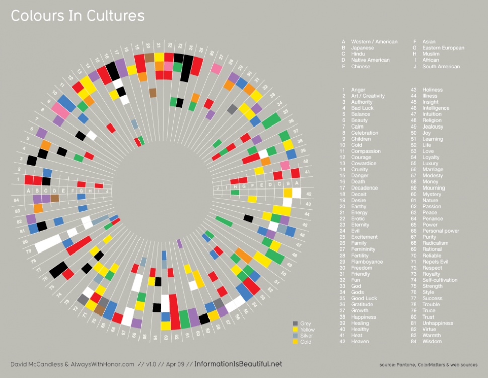
https://visual.ly/community/infographic/other/what-colors-mean-different-cultures
各个国家的颜色情感图,感觉很多,但是实际上颜色比较少
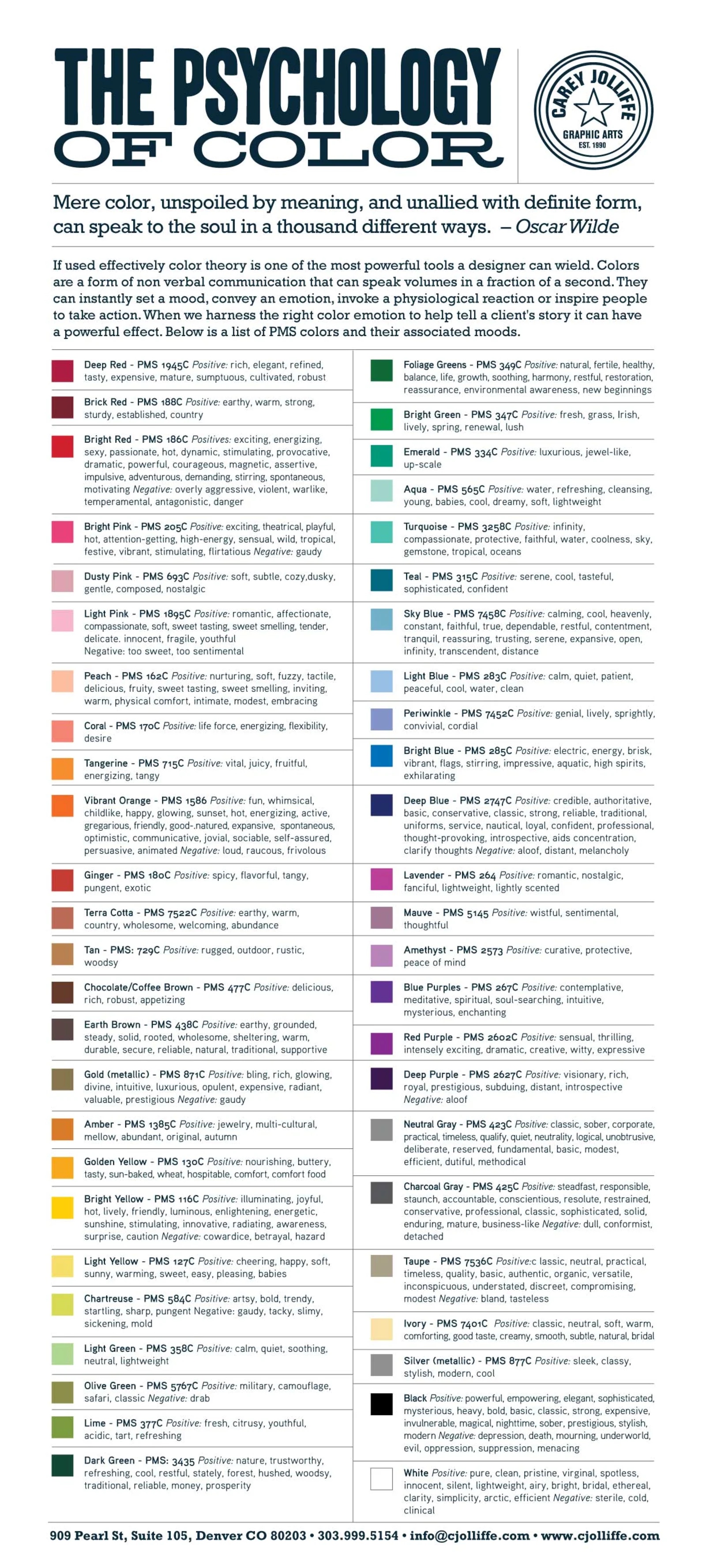
https://graf1x.com/color-psychology-emotion-meaning-poster/
只有核心颜色图
https://lifehacker.com/pick-the-right-color-for-design-or-decorating-with-this-5991303
https://www.pinterest.com/pin/29203097556548552/

https://www.dailyinfographic.com/what-colors-mean-in-different-cultures-infographic
http://www.arttherapyblog.com/online/color-meanings-symbolism/#.XVmF6WT7RXg
只讲了核心颜色
https://www.pinterest.com/pin/219902394291365592/
最详细的color name网页
对颜色
文档工具制作
https://github.com/phodal/2md
html转化为markdown
https://github.com/domchristie/turndown
这个是原始的网站工具
http://url2io.applinzi.com/docs
提取正文的网页服务
https://www.cnblogs.com/yetuweiba/p/4149683.html
提取网页正文的开源库的比较
https://www.cnblogs.com/jasondan/p/3497757.html
我为开源做贡献,网页正文提取——Html2Article
https://yq.aliyun.com/articles/622451
网页正文提取方法一二
https://www.yuanrenxue.com/crawler/news-crawler-content-extract.html
大规模异步新闻爬虫:网页正文的提取
https://dfkan.com/2333.html
使用API智能提取网页上的文章正文:url2io
https://www.jianshu.com/p/af5c5ef4f2f5
使用Python进行网页正文提取
http://www.elias.cn/MyProject/ExtMainText
ExtMainText —— 提取html文档正文
https://github.com/goose3/goose3
✨Python下非常好用的提取库


重要解决方案
Clean (cmd+shift+K)
Build core React - select React as the scheme in Xcode and build it (cmd+B)
Build the library that is failing (e.g. RCTText).
Build your app.
异常:React/RCTBridgeModule.h' file not found
首先要先把React Build一遍
https://facebook.github.io/react-native/docs/linking-libraries-ios.html
在把这里添加上react的依赖
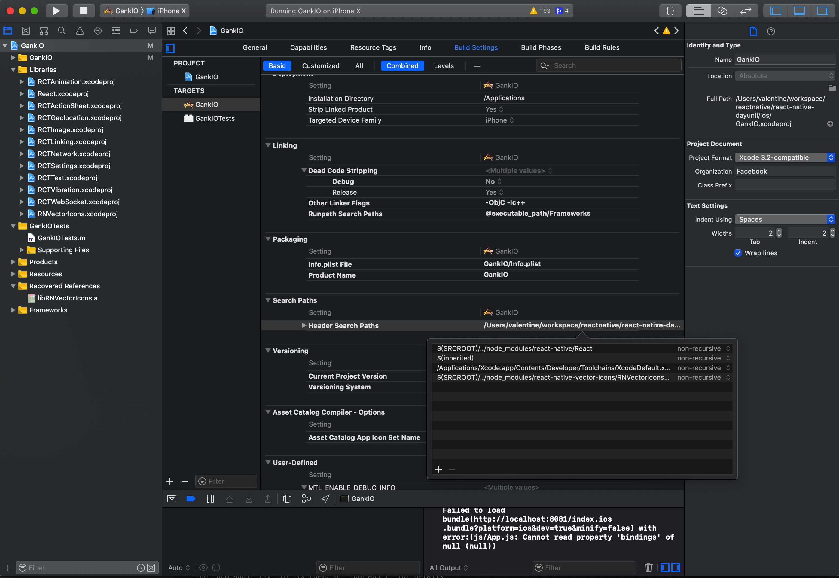
异常 Undefined symbols for architecture x86_64: "_JSClassCreate"
https://github.com/f111fei/react-native-unity-view/issues/89
这里需要添加javascript的依赖
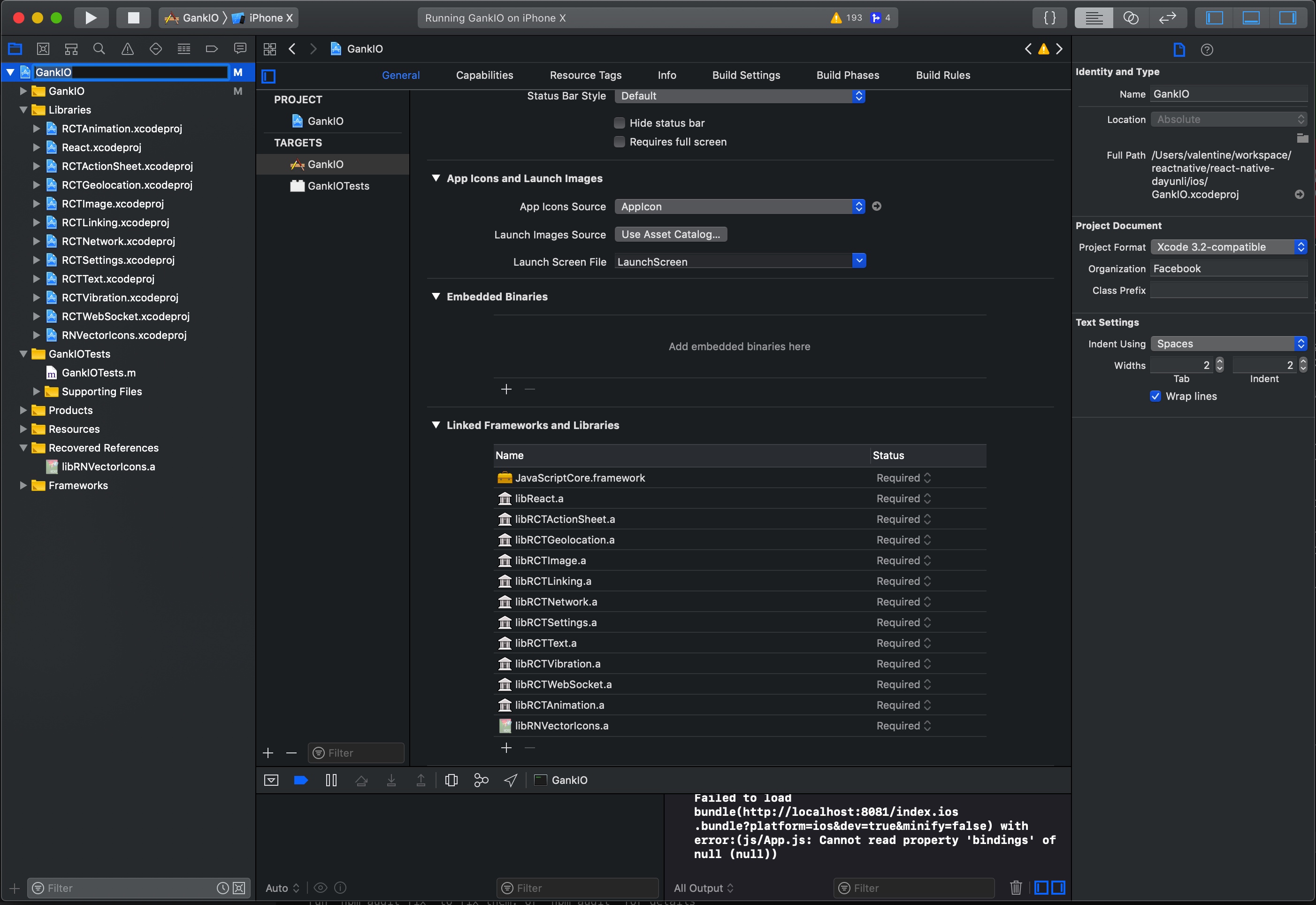
异常 ../node_modules/react-native/packager/react-native-xcode.sh: No such file or directory
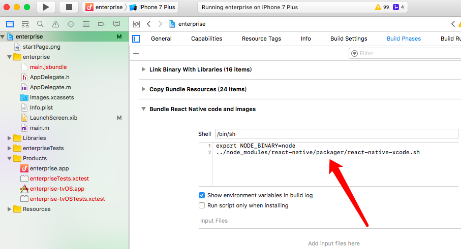
https://github.com/facebook/react-native/issues/14935
最后还是修改成scripts
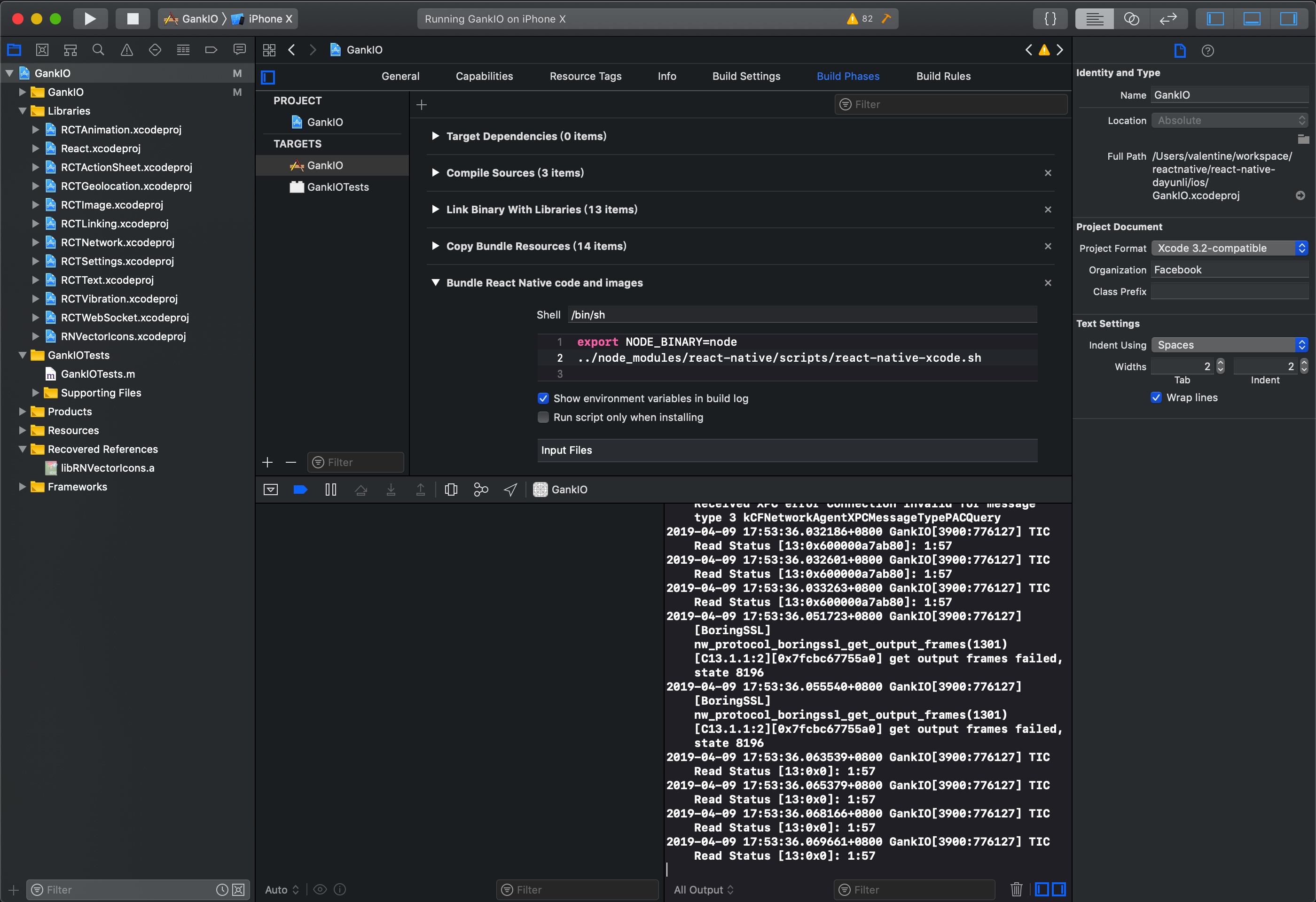
最后还是用scripts完成的。
问题:
react-native cannot read property 'bindings' of null
解决方案
https://stackoverflow.com/questions/51220030/react-native-cannot-read-property-bindings-of-null
最后是换了相关的babel包。
修改 babel
babel.rc
{
    "presets": ["module:metro-react-native-babel-preset"],
    "env": {
        "development": {
          "plugins": ["@babel/transform-react-jsx-source"]
        }
      },
      "plugins": ["@babel/plugin-proposal-nullish-coalescing-operator"]
}
需要更新依赖:
package.json文件如下
{
  "name": "GankIO",
  "version": "1.0.0",
  "private": true,
  "scripts": {
    "start": "node node_modules/react-native/local-cli/cli.js start",
    "test": "jest"
  },
  "dependencies": {
    "@babel/core": "^7.4.3",
    "@babel/plugin-transform-react-jsx": "^7.3.0",
    "react": "^16.8.3",
    "react-native": "^0.59.4",
    "react-native-deprecated-custom-components": "^0.1.2",
    "react-native-root-toast": "^2.1.0",
    "react-native-scrollable-tab-view": "^0.6.0",
    "react-native-swipe-list-view": "^1.4.1",
    "react-native-tab-navigator": "^0.3.3",
    "react-native-vector-icons": "^4.6.0",
    "react-redux": "^5.0.7",
    "redux": "^4.0.0",
    "redux-thunk": "^2.3.0",
    "whatwg-fetch": "^2.0.1"
  },
  "jest": {
    "preset": "react-native"
  },
  "devDependencies": {
    "@babel/plugin-proposal-nullish-coalescing-operator": "^7.4.3",
    "babel-jest": "23.4.2",
    "babel-preset-react-native": "5.0.1",
    "jest": "23.5.0",
    "react-test-renderer": "16.3.1"
  }
}
使用xcode进行编译
mac上可以将xcodeproj 的文件打开,然后再来进行编译,需要先编译React然后再编译Gank的话就可以成功
总结
所以可以看出来android和IOS的加载部分包还是有区别的。
要研究一下使用xcode来编译之后,那么如何debug呢
React Native国内镜像
一、使用淘宝镜像
1.临时使用
npm --registry https://registry.npm.taobao.org install express
2.持久使用
npm config set registry https://registry.npm.taobao.org
3.通过cnpm
npm install -g cnpm --registry=https://registry.npm.taobao.org
二、使用官方镜像
npm config set registry https://registry.npmjs.org/
三、查看npm源地址
npm config get registry
](http://www.positivehealth.com/article/mind-matters/the-logic-of-emotion!%5B%5D(media/15661454029978/15661486510896.jpg))
react Native 相关学习资料
React-Native学习指南
本指南汇集React-Native各类学习资源,给大家提供便利。
Awesome React Native components, news, tools, and learning material
Awesome React Native
An awesome style list that curates the best React Native libraries, tools, tutorials, articles and more. PRs are welcome!
相关组件学习
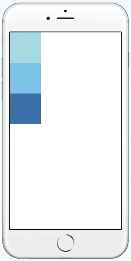
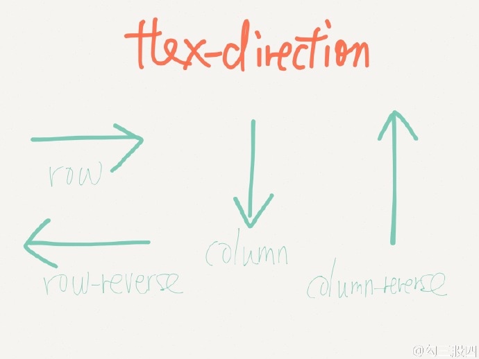
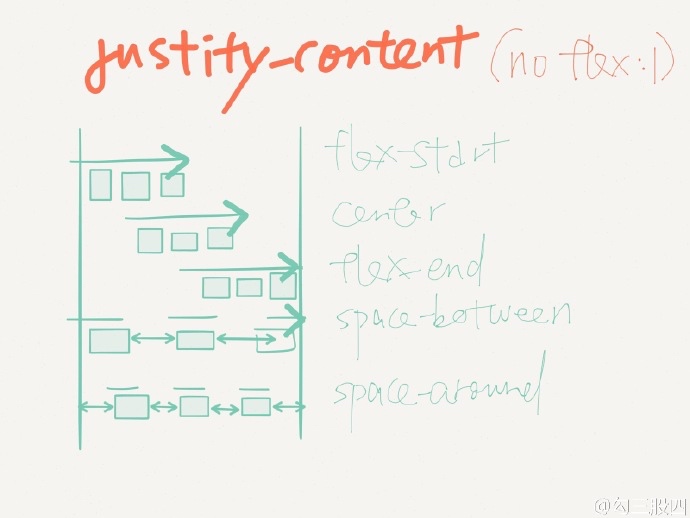
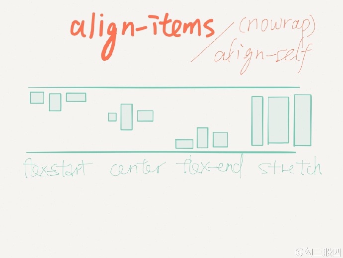
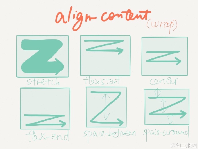
React Natvie FlexBox 的排版
整理相应的RN的排版方式,可以使用flex:1来定义不同的比例
react-native 屏幕尺寸和文字大小适配
react-Native适配不同的屏幕分辨率的方式,后面基本的开发完之后要在各个版本研究一下。
react native 跨平台button可以使用这个插件包
如何在react native中实现颜色渐变 - react-native-linear-gradient 基础教程
可以用来做button背景渐变,APP背景渐变等。
用的react-native-linear-gradient组件来制作背景渐变
Copyright © 2020 鄂ICP备16010598号-1